The Color Psychology of Perfume Packaging: How to Influence Consumer Behavior
Foundations of Color Psychology in Fragrance Packaging
The Science Behind Color Perception
Color perception plays a crucial role in how individuals connect with fragrance packaging, driven by psychological mechanisms. Studies, such as those from the Institute for Color Research, reveal that up to 90% of snap judgments can be based on color alone. This underscores the importance of understanding how the wavelengths of light, along with brightness and saturation, impact emotional responses. For instance, brighter colors often convey excitement and energy, while muted tones suggest calmness. The interplay of hue, saturation, and brightness forms the sensory foundation of brand identity. Companies leverage this by crafting packaging that attracts and maintains consumer interest, evidenced by market research highlighting the power of contrasts in color combinations. Colors not only draw attention but also communicate brand values, enhancing consumer engagement and perception.
Emotional Triggers of Common Perfume Packaging Hues
Different hues used in perfume packaging serve as powerful emotional triggers, influencing consumer behavior and perceptions. For instance, calming colors like blue are often adopted by brands offering fresh or soothing scents. On the other hand, vibrant colors like red are associated with excitement and are thus used for fragrances marketed to evoke passion or allure. Marketing studies indicate that 85% of shoppers make purchase decisions based on color, demonstrating its paramount importance. Luxurious colors, such as gold or silver, are known to elevate the perceived value of a product. Renowned brands successfully exploit these emotional triggers to enhance the appeal of their fragrances. By aligning packaging colors with emotional cues, these brands not only elevate their market presence but also forge strong connections with consumers, turning packaging into a vital marketing asset.
Cultural Nuances in Color Symbolism for Global Markets
Western vs Eastern Color Associations
Understanding color symbolism requires recognizing cultural variances, particularly between Western and Eastern contexts. In many Western cultures, white is associated with purity and innocence, often seen in weddings, whereas black signifies mourning and loss. Eastern interpretations can be vastly different; for instance, red represents happiness and fortune in many Asian cultures and is prevalent during celebrations. Misinterpreting these cultural symbols can lead to marketing failures. For example, Pepsi's campaign featuring the color blue, which is associated with mourning in some Eastern cultures, faced backlash. Successful global brands such as Coca-Cola have localized their color choices, adapting their iconic red to align with cultural meanings, as supported by market data indicating increased brand acceptance and loyalty.
Navigating Regional Preferences in Packaging Design
Adapting packaging designs to align with regional preferences is increasingly essential for global brands. This approach enhances resonance with local audiences, as seen in case studies of companies like Dove, which altered packaging color schemes for different markets. Surveys indicate distinct color preferences across regions—blue is favored in North America for its calm and trustworthy connotations, while red resonates with excitement and energy in many Asian countries. Brands utilize color preference testing strategies, conducting focus groups and employing advanced algorithms to predict market responses. These insights empower brands to tailor their packaging designs effectively, ensuring optimal consumer engagement in diverse global markets.
Strategic Color Selection in Perfume Marketing
Aligning Brand Identity With Chromatic Choices
Brand identity is a fundamental concept in marketing, representing the essence of a company and how it wishes to be perceived. Colors act as a visual shorthand for a brand's values and message. For instance, brands like Chanel and Dior utilize a consistent palette in their packaging and marketing materials to stand for luxury and elegance. Research correlates effective branding with coherent color usage, enhancing consumer recognition and trust. According to industry experts, resonating with target audiences through strategic color choices is crucial in establishing and maintaining brand loyalty. Colors can evoke distinct emotional responses, which, when aligned with a brand's identity, amplify its voice and connect more profoundly with its audience.
Color Trends in Luxury vs Mass Market Fragrances
In the fragrance market, luxury and mass-market products diverge significantly in their color trends. Luxury fragrances typically favor opulent and muted tones—like royal blues, blacks, and golds—imparting a sense of sophistication and exclusivity. In contrast, mass-market fragrances often embrace vibrant and bold hues to appeal to a broader and more diverse demographic. Sales data reveals that color can distinctly affect consumer perceptions and market positioning, influencing purchase decisions. Recent launches, such as a perfume released with a rich emerald hue, have shown substantial traction in luxury markets, whereas a dynamic orange bottle resonated well within the mass-market segment. These examples underscore the importance of color in communicating brand and product differentiation across market segments.
Case Studies: Successful Color Psychology Implementation
Iconic Perfume Brands' Packaging Strategies
Renowned perfume brands like Yves Saint Laurent have effectively harnessed color psychology in their packaging strategies, resulting in significant consumer engagement and sales boosts. For instance, Yves Saint Laurent uses bold, iconic colors in its packaging that communicate luxury and allure. This strategic color use not only attracts customers but also evokes emotional connections, enhancing brand storytelling. Sales data supports these packaging strategies; brands exhibiting strong color identities report increased consumer interest and higher purchase rates. The emotional engagement fostered through packaging colors plays a vital role in crafting compelling narratives that resonate deeply with consumers, influencing purchase decisions.
Sustainable Packaging Innovations Using Kraft Materials
Kraft paper is revolutionizing packaging with its sustainable materials, integrating color psychology for a modern eco-friendly appeal. The use of kraft paper offers brands an opportunity to appeal to environmentally conscious consumers, with statistics indicating a rise in sales among brands prioritizing sustainability. Innovations in kraft packaging leverage its natural texture, which, combined with clever color applications, appeals aesthetically to consumers while maintaining green principles. Brands are innovating by blending the earthy appeal of kraft with colors, creating packaging that is both visually appealing and sustainable, thus driving eco-conscious consumer preferences.
Product Showcase: Color-Optimized Packaging Solutions
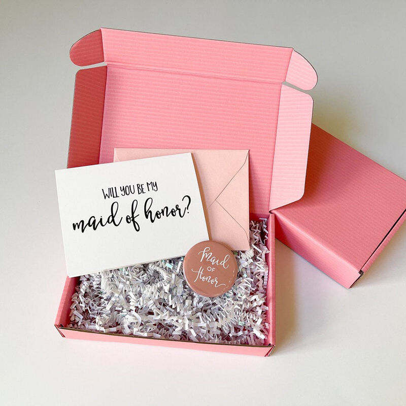
Light Pink Mailer Box: Feminine Appeal Through Pastel Tones
Light pink is a color that embodies softness and femininity, making it a popular choice for packaging aimed at women's products, such as perfumes. The Custom Printed Cardboard Corrugated Carton Shipping Package Small Light Pink Mailer Box provides a perfect example of leveraging pastel tones to create an inviting and gentle appeal. According to consumer behavior studies, pastel packaging often resonates well in gifting contexts, suggesting a sign of care and thoughtfulness. Brands can incorporate pastel colors into their packaging without losing brand identity by maintaining core brand elements such as logo design and typography in complementary shades.

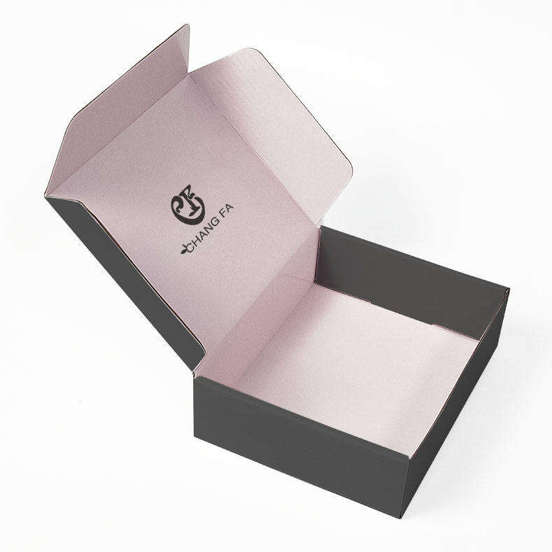
Matte Black Shipping Box: Sophistication in Monochrome
Matte black packaging has long been associated with luxury and sophistication, with its minimalist design aesthetic often used by high-end brands to convey a sense of exclusivity and elegance. The Recycle Matte Black Mailer Packing Custom Shipping Box Package exemplifies this trend, offering a monochrome finish that appeals to consumers seeking premium experiences. Studies reveal that black packaging can increase perceptions of value, which many luxury brands utilize to justify premium pricing. When designing monochrome packaging, it's essential to consider the psychological impact on consumers—black is often seen as commanding and authoritative, making it an ideal choice for luxury products.

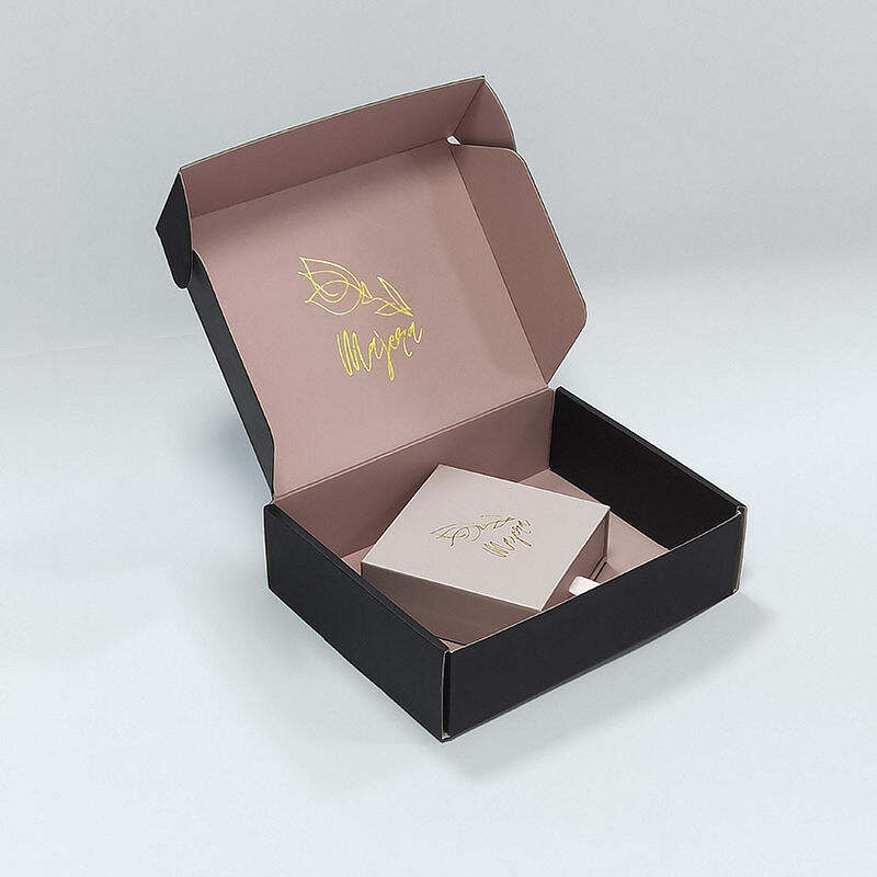
Biodegradable Black Kraft Box: Eco-Conscious Luxury
The Custom Size Biodegradable Kraft Package OEM Branded Label Print Black Cardboard Shipping Box represents the fusion of luxury and sustainability, catering to eco-conscious consumers who do not wish to compromise on style or quality. The use of biodegradable materials in packaging is increasingly important as more consumers prioritize environmental responsibility. Statistics indicate a marked rise in consumer demand for sustainable options, with many willing to pay more for such products. Not only does kraft material offer functional benefits, but it also provides an earthy aesthetic that can be enhanced with color choices to boost marketability.

 EN
EN
 AR
AR
 HR
HR
 CS
CS
 DA
DA
 NL
NL
 FI
FI
 FR
FR
 DE
DE
 EL
EL
 HI
HI
 IT
IT
 JA
JA
 KO
KO
 NO
NO
 PL
PL
 PT
PT
 RO
RO
 RU
RU
 ES
ES
 SV
SV
 TL
TL
 ID
ID
 LT
LT
 SL
SL
 VI
VI
 HU
HU
 MT
MT
 TH
TH
 TR
TR
 FA
FA
 AF
AF
 MS
MS
 GA
GA
 MK
MK
 AZ
AZ
 BN
BN
 LO
LO
 LA
LA
 MN
MN
